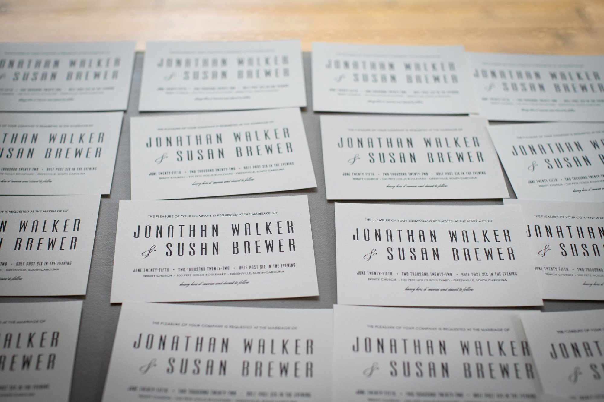
The Invitation
I have been dreaming about this invitation for months now and finally (finally!) they have been created. But it was definitely a close call.
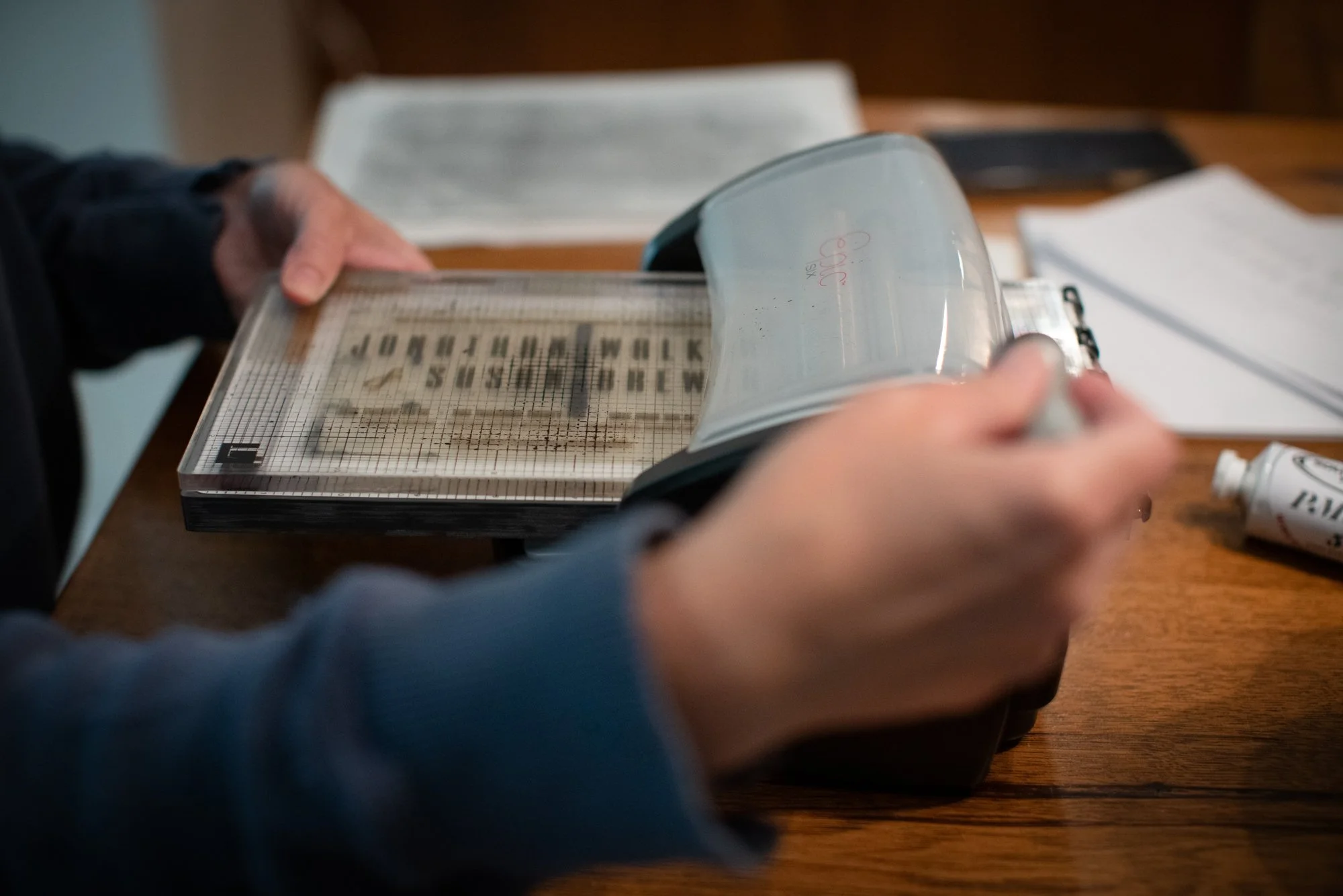
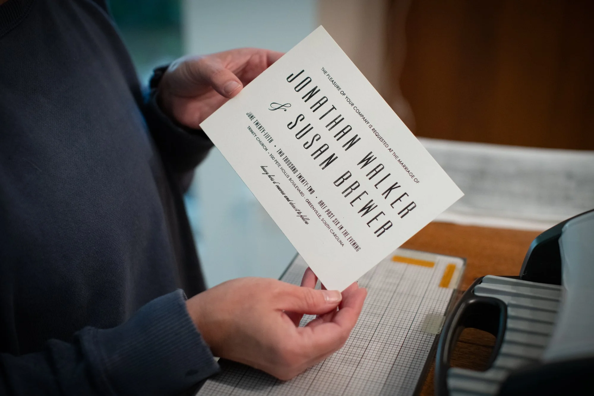
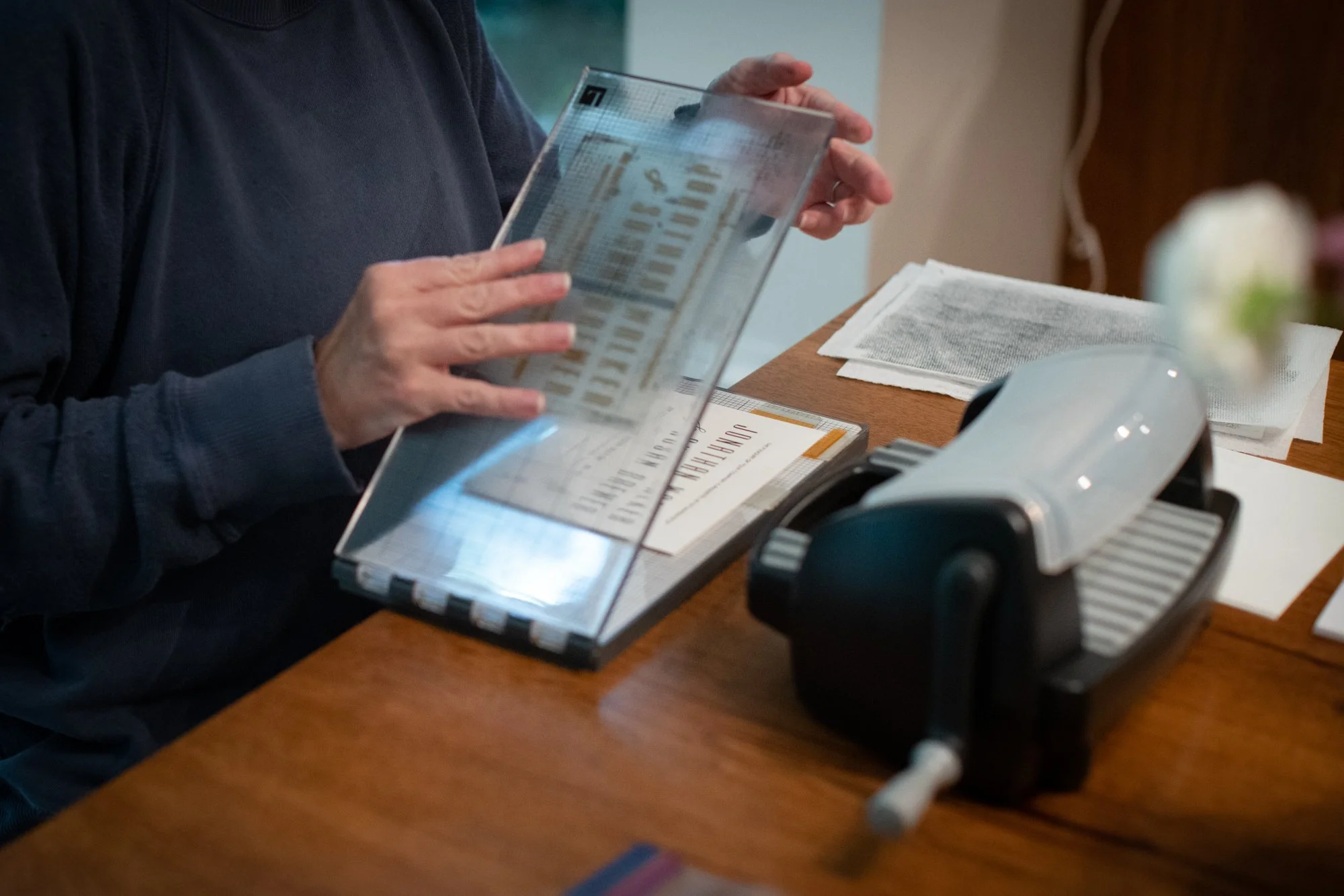
As I said before, years ago I purchased an at home letterpress machine and beautiful paper to use with it. When I embossed before, I always used the machine for blind letterpressing. Because of the sizes of the fonts on the invitation, I needed to use ink this time. I was both very nervous, but naive at the same time. I knew it would take time, but I had no idea how much!
Fortunately I purchased my plate from an extremely easy company to work with - Boxcar Press. They talked me through the whole process and I was even able to purchase a plate for the return address and the house drawing, all for the price of my main plate. Very kind customer service.
They told me to purchase specific oil based letterpress ink from a company online who would custom mix my ink per my order. To say I felt a ton of pressure to pick the perfect ink color is an understatement. I spent hours pouring over the specific grey to use. Cool Greys. Warm Greys. Uncoated vs. Coated. Finally I hit send on my order and waited with eager anticipation for everything to arrive.

Mary Susan is wise in so many ways and one of them is in wedding planning (being a former wedding planner herself). She constantly reminds me that the process will take longer than I think. Kindly she offered to take an afternoon from her sabbatical to help me letterpress all of the invitations, but wisely she told me to practice first.
Hannah is currently taking print making at the Fine Arts Center and was able to give me a tutorial and all of the tips for creating the invitation of my dreams. But man, even with all of her advice, it took us forever to get the skill down to create crisp letters. And the ink? It wasn’t grey. After all of that worry, it wasn’t even the color I picked. I ended up purchasing grey from a local art store, but being water based it was even more difficult to use. So some invitations are grey and most are black. Who knows which one you will get!
Speaking of hours, I perused through mid century fonts to find a font both Hannah and I liked for the envelopes. I think the one we landed on is beautiful. Probably no one will notice, but again it is the details that matter to me and I love this specific nod to our overall theme. Hannah worked so hard on them and I think it shows. I bribed her first with lunch and coffee from The Commons, but unfortunately it was a days process not hours. I think more “treats” are in the works!

Even though we almost moved to printing instead of letterpress and it took days longer than I thought it would, I love the finished product. It is exactly what I was hoping for.
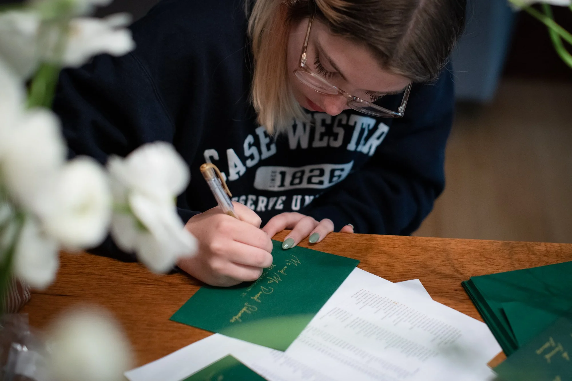
Oh, and I also spent hours and hours finding the right stamp and the RSVP cards and everything else going into that beautiful envelope. Can’t wait for you to open it when it arrives at your door.
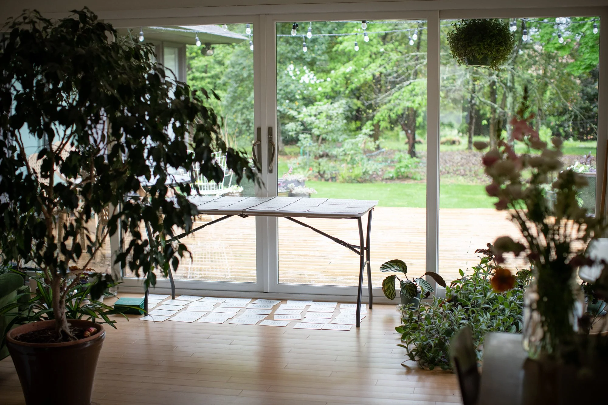
Rainy day for my sunroom/wedding prep station. Not only does it hold all of my plant/flower collection, but is now a drying station for all of the invitations!